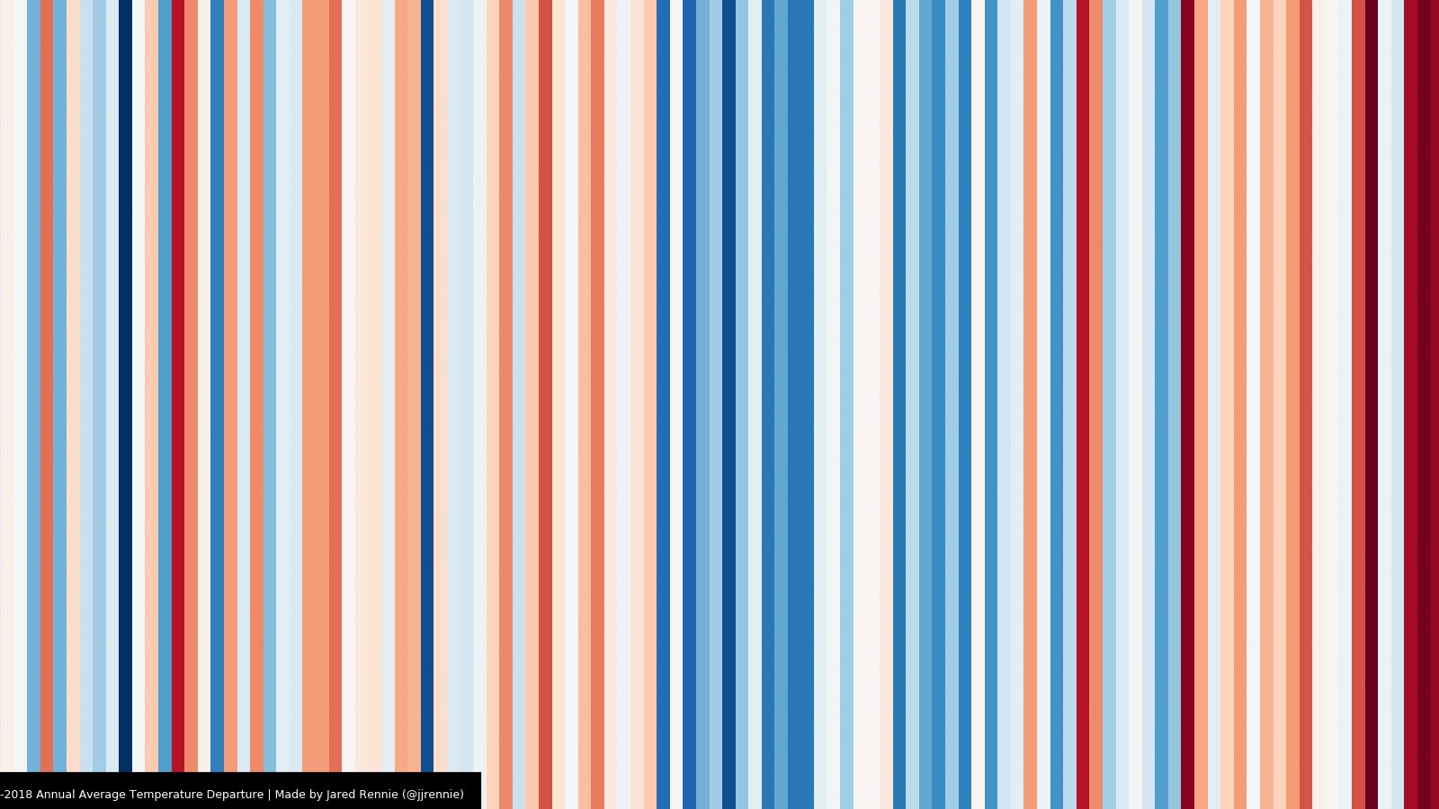
The warming stripes image for Buncombe County, North Carolina.
Inspired by climate scientist Ed Hawkins’ Show Your Stripes project, NCICS’s Jared Rennie has developed an online geographic information system (GIS) tool to generate “Warming Stripes” as well as “Precipitation Stripes” for every county in the United States. These simple images are intended to provide a quick sense of changes over time and to serve as conversation-starters about climate change at local scales.
The tool uses the nClimGrid data set from NOAA’s National Centers for Environmental Information (NCEI) to generate simple images indicating how annual average temperature and precipitation values in each county have varied in comparison to the 20th century (1901–2000) average for that county. The data are drawn from NCEI’s Climate at a Glance website, which is where you can go to learn more about the data, generate detailed time series plots, examine tables of annual ranks, and experiment with different base periods.
To view the stripes for your favorite counties, you can use the map embedded below or click on http://bit.ly/ncics_stripes to open a copy in a new browser window. You can zoom/scroll or use the search button to locate a county, then click with your mouse to pop up the temperature stripe for that county. Click on the small right arrow to view the precipitation stripe. Click on either image to display a larger version of the image. We encourage you to download your favorite images and share them on social media using the #ShowYourStripes hashtag.