Data from the Fourth National Climate Assessment
The following figures were created by the National Climate Assessment (NCA) Technical Support Unit (TSU) for the fourth NCA report published in November, 2018.
Click “Download data files” to download the relevant data files.
Please cite the following reference when using any of these figures:
USGCRP, 2018: Impacts, Risks, and Adaptation in the United States: Fourth National Climate Assessment, Volume II [Reidmiller, D.R., C.W. Avery, D.R. Easterling, K.E. Kunkel, K.L.M. Lewis, T.K. Maycock, and B.C. Stewart (eds.)]. U.S. Global Change Research Program, Washington, DC, USA, 1515 pp. doi: 10.7930/NCA4.2018.
NCA4 Data Figures
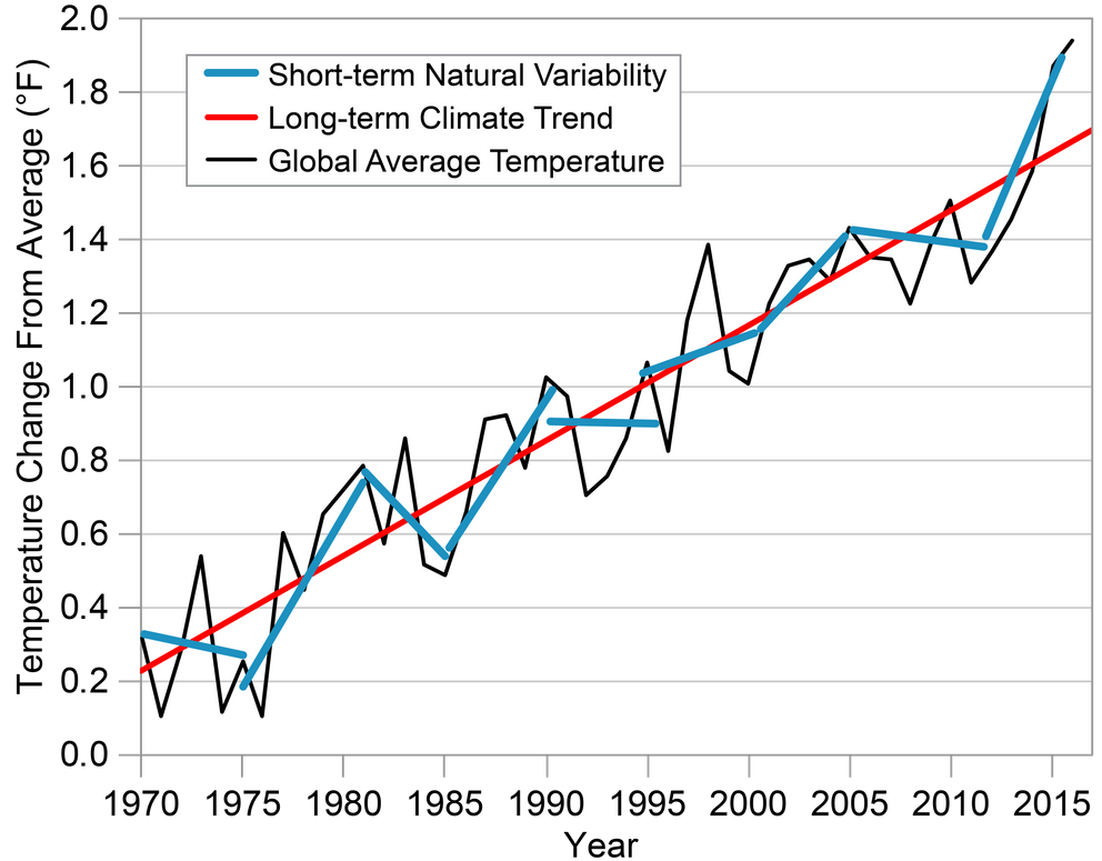
Short-Term Variability Versus Long-Term Trend
Short-term trends in global temperature (blue lines show approximate temperature trends at five-year intervals) can range from decreases to sharp increases. The evidence of climate change is based on long-term trends over 30 years or more (red line). The black line shows the annual average change in global surface temperature from 1970 to 2016 relative to 1901–1960. Source: adapted from Walsh et al. 2014.{{< tbib '6' 'ee2ad491-9e02-4f29-859a-07970e4d1de1' >}}
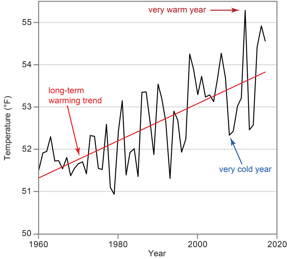
U.S. Annual Average Temperature
This figure shows the annual average surface temperature for the contiguous U.S. (black line) from 1960 to 2017, and the long-term warming trend (red line). Climate change refers to the changes in average weather conditions that persist for an extended period of time, over multiple decades or even longer. Year-to-year and even decade-to-decade, conditions do not necessarily tell us much about long-term changes in climate. One cold year, or even a few cold years in a row, does not contradict a long-term warming trend, just as one hot year does not prove it. Source: adapted from Walsh et al. 2014.{{< tbib '6' 'ee2ad491-9e02-4f29-859a-07970e4d1de1' >}}
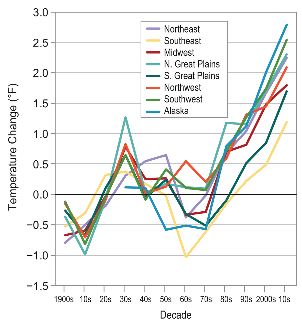
Temperature Change Varies by Region
This graph shows changes in decadal-averaged temperature relative to the 1901–1960 average for eight of the ten NCA regions (see Front Matter, Figure 1). This figure shows how regional temperatures can be quite variable from decade to decade. All regions, however, have experienced warming over the last three decades or more. The most recent decade, the 2010s, refers to the 6-year period of 2001–2016. Source: adapted from Walsh et al. 2014.{{< tbib '6' 'ee2ad491-9e02-4f29-859a-07970e4d1de1' >}} Comparable data is not currently available for the Hawaiʻi and U.S-Affiliated Pacific Islands or U.S. Caribbean regions.
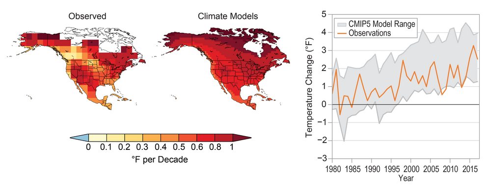
Comparison of Climate Models and Observed Temperature Change
Climate simulations (right map) can capture the approximate geographical patterns and magnitude of the surface air temperature trend seen in observational data for the period 1980–2017 (left map). The warming pattern seen in the right map is an average based on 43 different global climate models from the Coupled Model Intercomparison Project Phase 5 (CMIP5). The graphical representation shows the range of temperature changes simulated by the models for North America (relative to 1901–1960; gray shading, 5th to 95th percentile range) overlaid by the observed annual average temperatures over North America (orange line). The observed temperature changes are a result of both human contributions to recent warming and natural temperature variations. Averaging the simulations from multiple models suppresses the natural variations and thus shows mainly the human contribution, which is part of the reason small-scale details are different between the two maps. Sources: (maps) adapted from Walsh et al. 2014{{< tbib '6' 'ee2ad491-9e02-4f29-859a-07970e4d1de1' >}} and (graph) NOAA NCEI and CICS-NC.
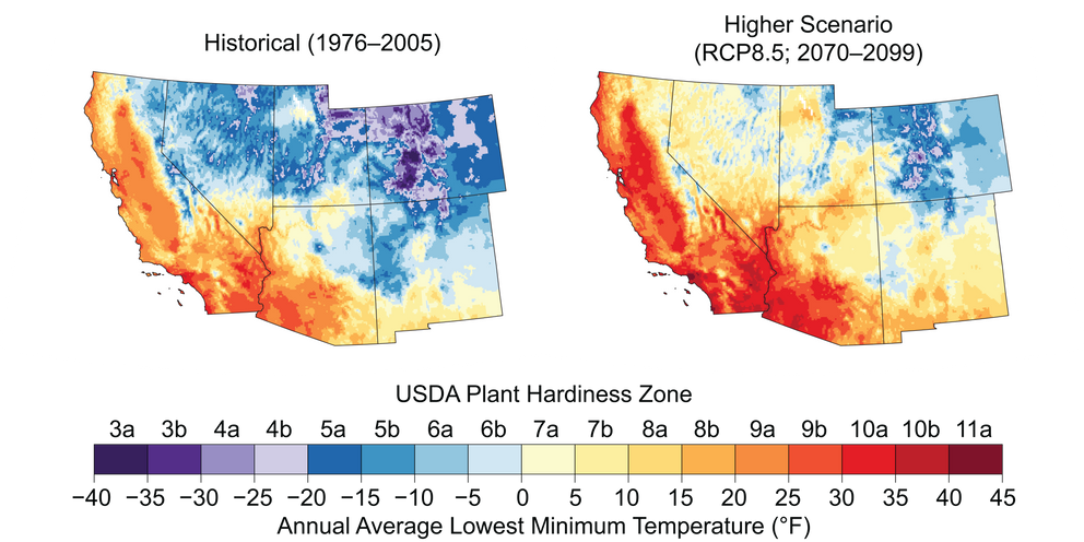
Projected Shift in Agricultural Zones
The U.S. Department of Agriculture plant hardiness zones indicate the cold temperature requirements of crops. Increases in temperature under the higher scenario (RCP8.5), would shift these zones northward and upslope, from the period 1976—2005 (left, modeled historical) compared to projections for 2070—2099 (right, average of 32 general circulation models). Sources: NOAA NCEI and CICS-NC

Severe Drought Reduces Water Supplies in the Southwest
Since 2000, drought that was intensified by long-term trends of higher temperatures due to climate change has reduced the flow in the Colorado River (top left), which in turn has reduced the combined contents of Lakes Powell and Mead to the lowest level since both lakes were first filled (top right). In the Upper Colorado River Basin that feeds the reservoirs, temperatures have increased (bottom left), which increases plant water use and evaporation, reducing lake inflows and contents. Although annual precipitation (bottom right) has been variable without a long-term trend, there has been a recent decline in precipitation that exacerbates the drought. Combined with increased Lower Basin water consumption that began in the 1990s, these trends explain the recently reduced reservoir contents. Straight lines indicate trends for temperature, precipitation, and river flow. The trends for temperature and river flow are statistically significant. Sources: Colorado State University and CICS-NC. Temperature and precipitation data from: PRISM Climate Group, Oregon State University, http://prism.oregonstate.edu, accessed 20 June 2018.
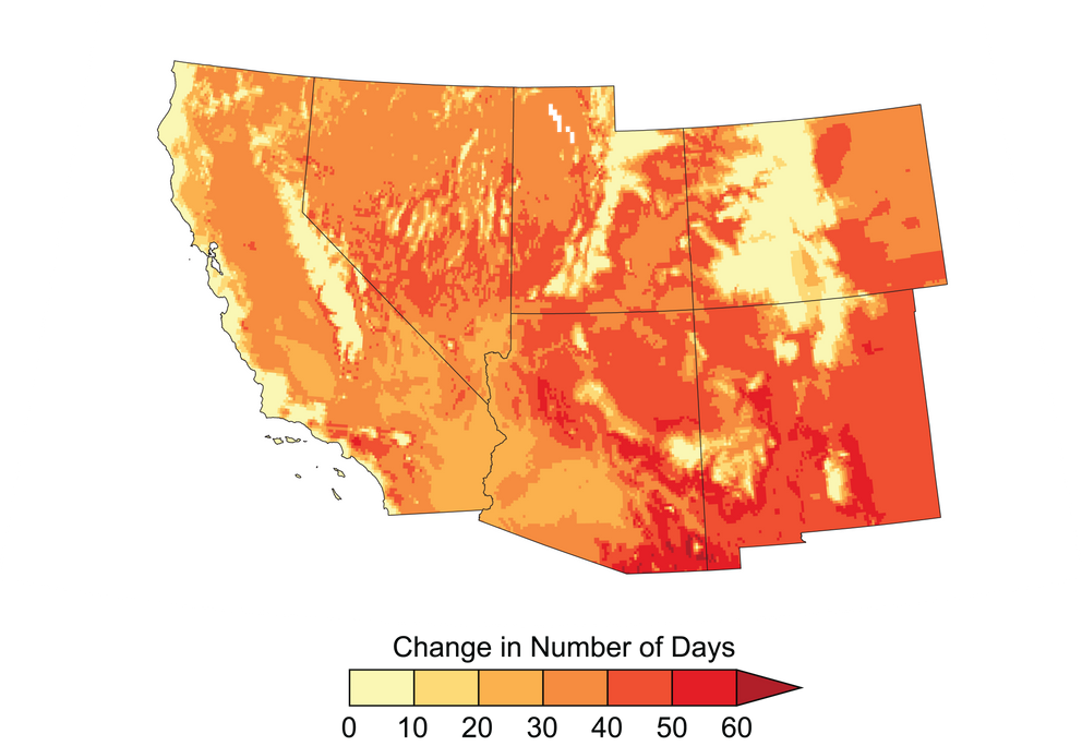
Projected Increases in Extreme Heat
Under the higher scenario (RCP8.5), extreme heat would increase across the Southwest, shown here as the increase in the average number of days per year when the temperature exceeds 90°F (32°C) by the period 2036–2065, compared to the period 1976–2005.{{< tbib '23' '29960c69-6168-4fb0-9af0-d50bdd91acd3' >}} Heat waves increase the exposure of people to heat stroke and other illnesses that could cause death.{{< tbib '30' 'f1e633d5-070a-4a7d-935b-a2281a0c9cb6' >}} Source: adapted from Vose et al. 2017.{{< tbib '23' '29960c69-6168-4fb0-9af0-d50bdd91acd3' >}}
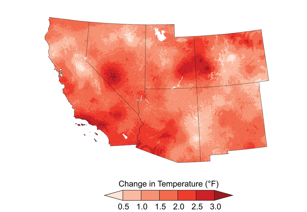
Temperature Has Increased Across the Southwest
Temperatures increased across almost all of the Southwest region from 1901 to 2016, with the greatest increases in southern California and western Colorado.{{< tbib '23' '29960c69-6168-4fb0-9af0-d50bdd91acd3' >}} This map shows the difference between 1986–2016 average temperature and 1901–1960 average temperature.{{< tbib '23' '29960c69-6168-4fb0-9af0-d50bdd91acd3' >}} Source: adapted from Vose et al. 2017.{{< tbib '23' '29960c69-6168-4fb0-9af0-d50bdd91acd3' >}}
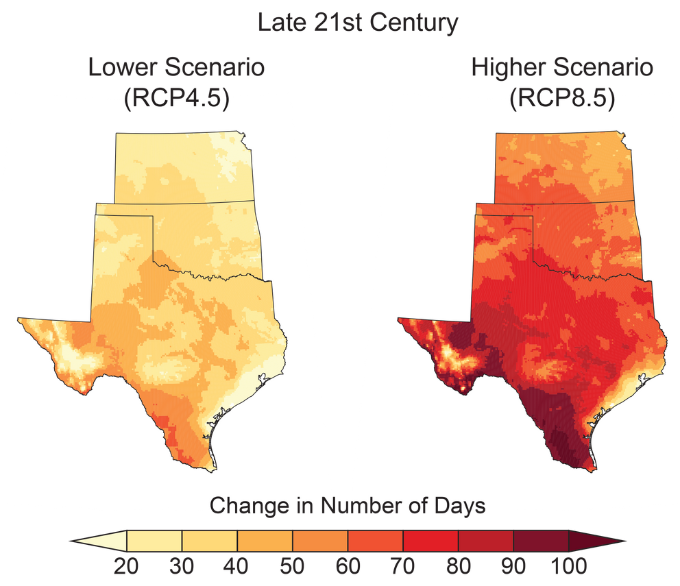
Projected Increase in Number of Days Above 100ºF
Under both lower- and higher-scenario climate change projections, the number of days exceeding 100°F is projected to increase markedly across the Southern Great Plains by the end of the century (2070–2099 as compared to 1976–2005). Sources: NOAA NCEI and CICS-NC.
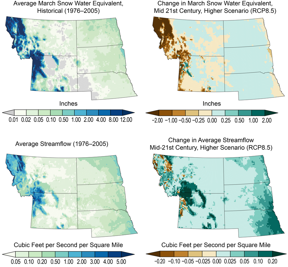
Hydrologic Changes Across the Northern Great Plains
These maps show historical (left; 1976–2005) and projected changes (right; 2036-2065) under a higher scenario (RCP8.5) in average snowpack (top row) and annual streamflow (bottom row). Snowpack is measured in terms of snow water equivalent, or SWE—the depth in inches of the amount of water contained in the snowpack. The top two maps show average values for March to provide historical and future end-of-season estimates of SWE. This illustrates projected warming and potential snow loss. Projected decreases in snowpack across montane western regions in the upper-right plot are primarily the result of projected warming at the highest elevations. Projected increases in snow at lower elevations are less important, since those changes are relative to a much lower average (top left) than in montane regions. Similarly, annual streamflows are expected to increase across much of the eastern part of the region, with isolated but important decreases in the western highlands. In this context, streamflow refers to the sum of surface runoff and subsurface flow for each location in space. Sources: NOAA NCEI and CICS-NC.
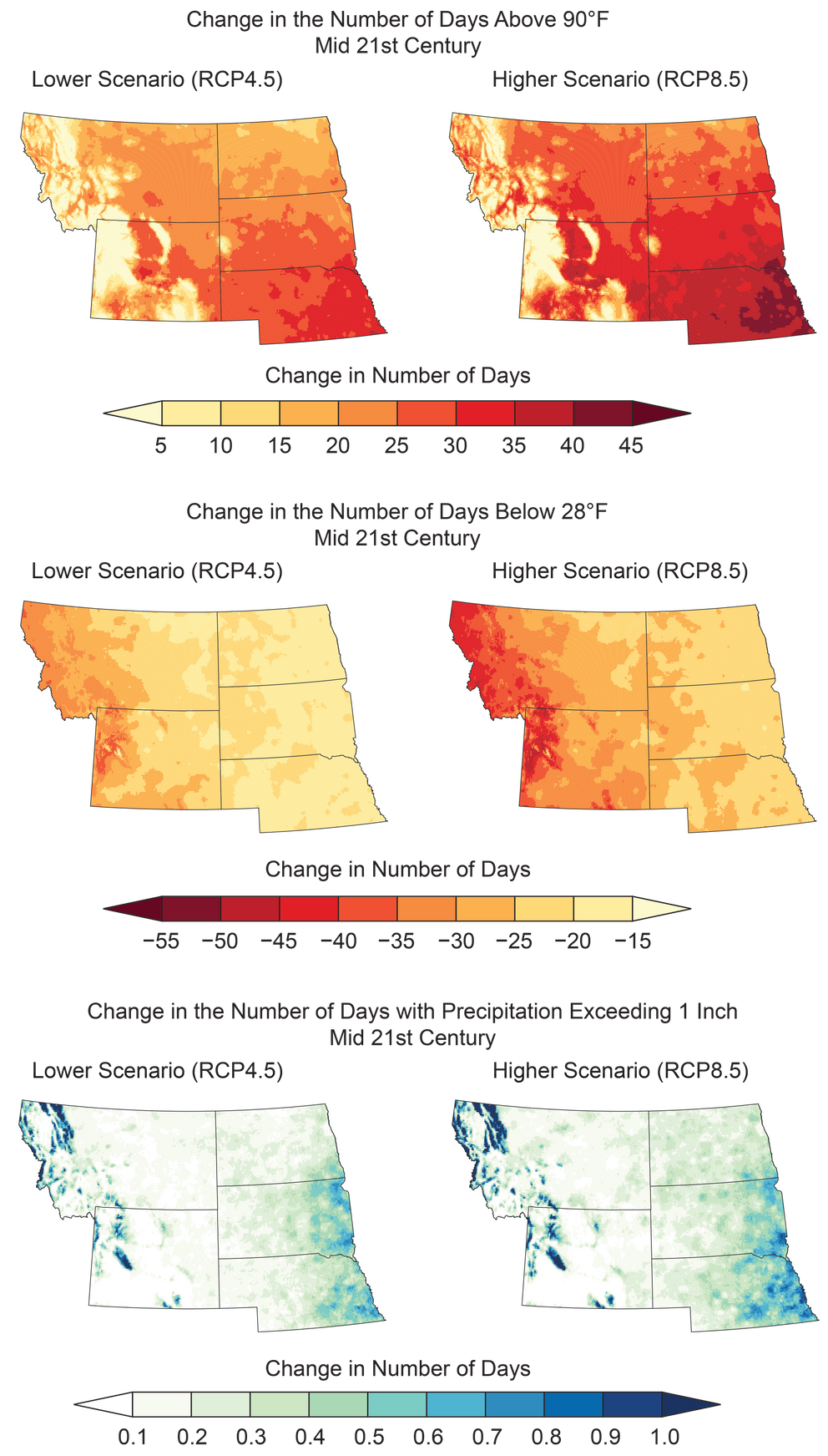
Projected Changes in Very Hot Days, Cool Days, and Heavy Precipitation
Projected changes are shown for (top) the annual number of very hot days (days with maximum temperatures above 90°F, an indicator of crop stress and impacts on human health), (middle) the annual number of cool days (days with minimum temperatures below 28°F, an indicator of damaging frost), and (bottom) heavy precipitation events (the annual number of days with greater than 1 inch of rainfall; areas in white do not normally experience more than 1 inch of rainfall in a single day). Projections are shown for the middle of the 21st century (2036–2065) as compared to the 1976–2005 average under the lower and higher scenarios (RCP4.5 and RCP8.5). Sources: NOAA NCEI and CICS-NC.
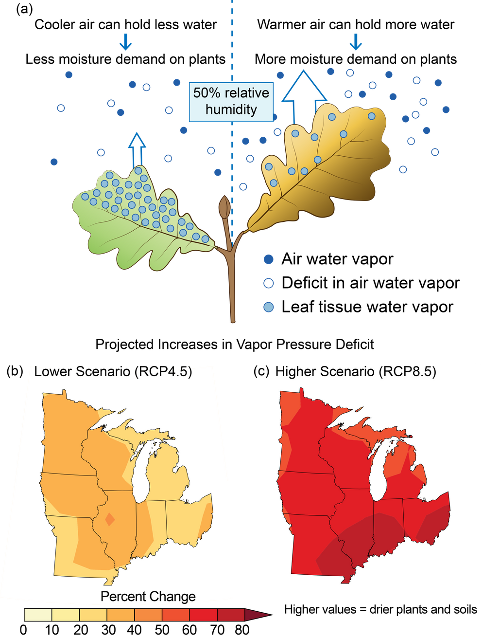
Drying Effect of Warmer Air on Plants and Soils
As air temperature increases in a warming climate, vapor pressure deficit (VPD) is projected to increase. VPD is the difference between how much moisture is in the air and the amount of moisture in the air at saturation (at 100% relative humidity). Increased VPD has a drying effect on plants and soils, as moisture transpires (from plants) and evaporates (from soil) into the air. (a) Cooler air can maintain less water as vapor, putting less demand for moisture on plants, while warmer air can maintain more water as vapor, putting more demand for moisture on plants. (b, c) The maps show the percent change in the moisture deficit of the air based on the projected maximum 5-day VPD by the late 21st century (2070–2099) compared to 1976–2005 for (b) lower and \\(c) higher scenarios (RCP4.5 and RCP8.5). Sources: U.S. Forest Service, NOAA NCEI, and CICS-NC.
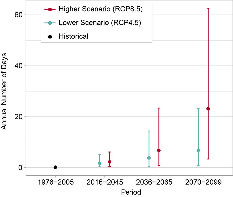
Days Above 100°F for Chicago
This graph shows the annual number of days above 100°F in Chicago for the historical period of 1976–2005 (black dot) and projected throughout the 21st century under lower (RCP4.5, teal) and higher (RCP8.5, red) scenarios. Increases at the higher end of these ranges would pose major heat-related health problems for people in Chicago. As shown by the black dot, the average number of days per year above 100°F for 1976–2005 was essentially zero. By the end of the century (2070–2099), the projected number of these very hot days ranges from 1 to 23 per year under the lower scenario and 3 to 63 per year under the higher scenario. For the three future periods, the teal and red dots represent the model-weighted average for each scenario, while the vertical lines represent the range of values (5th to 95th percentile). Both scenarios show an increasing number of days over 100°F with time but increasing at a faster rate under the higher scenario. Sources: NOAA NCEI and CICS-NC.
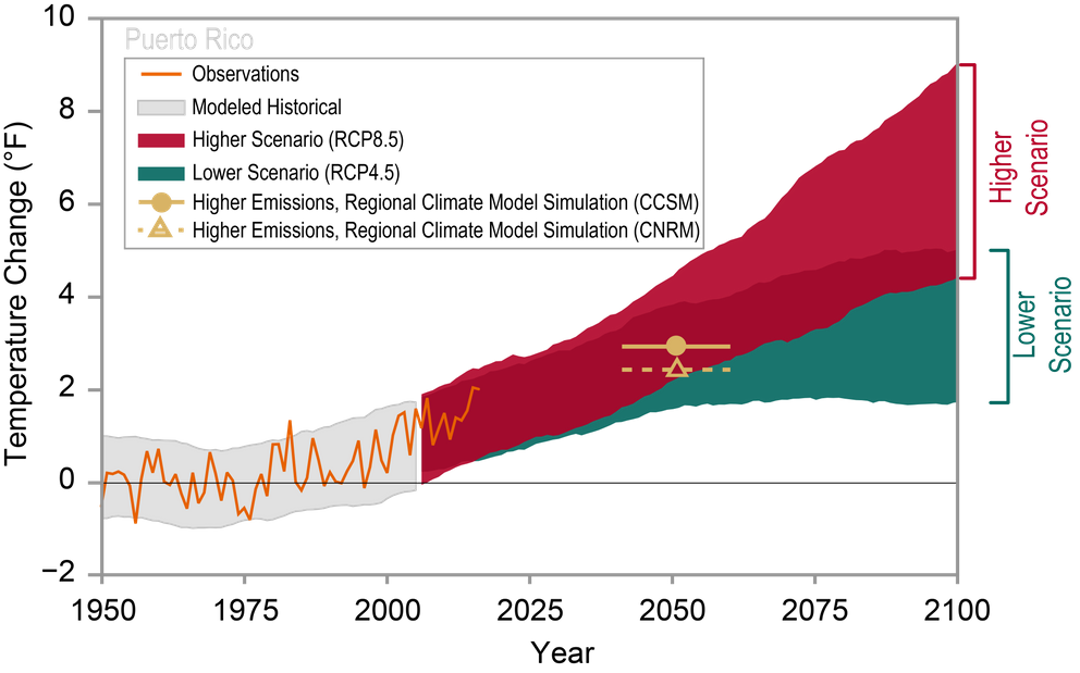
Observed and Projected Temperature Change for Puerto Rico
Observed and projected temperature changes are shown as compared to the 1951–1980 average. Observed data are for 1950–2017, and the range of model simulations for the historical period is for 1950–2005. The range of projected temperature changes from global climate models is shown for 2006–2100 under a lower (RCP4.5) and a higher (RCP8.5) scenario (see the Scenario Products section of App. 3). Projections from two regional climate models are shown for 2036–2065, and they align with those from global models for the same period.{{< tbib '29' '8b59c4bd-ba59-4567-9f5d-9c2422b7e05b' >}},{{< tbib '30' '66a435ae-179c-49f4-981b-248d647b9579' >}} Sources: NOAA NCEI, CICS-NC, and USGS.

2017 Tropical Cyclone Tracks
Tropical cyclone tracks for the 2017 Atlantic hurricane season. Data are based on the preliminary 'operational best-track' provided by the NOAA National Hurricane Center and may change slightly after post-season reanalysis is completed. Sources: NOAA NCEI and ERT, Inc.
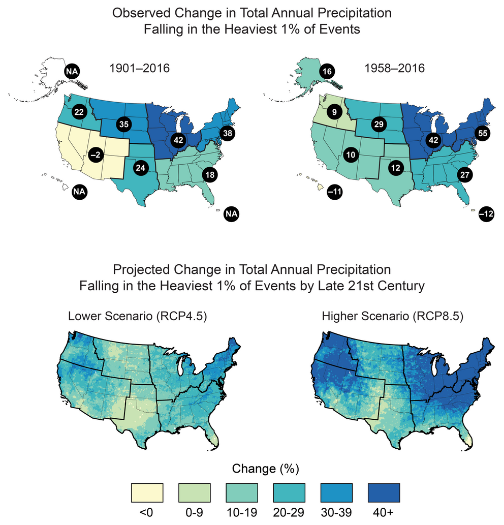
Observed and Projected Change in Heavy Precipitation
Heavy precipitation is becoming more intense and more frequent across most of the United States, particularly in the Northeast and Midwest, and these trends are projected to continue in the future. This map shows the observed (top; numbers in black circles give the percentage change) and projected (bottom) change in the amount of precipitation falling in the heaviest 1% of events (99th percentile of the distribution). Observed historical trends are quantified in two ways. The observed trend for 1901–2016 (top left) is calculated as the difference between 1901–1960 and 1986–2016. The values for 1958–2016 (top right), a period with a denser station network, are linear trend changes over the period. The trends are averaged over each National Climate Assessment region. Projected future trends are for a lower (RCP4.5, left) and a higher (RCP8.5, right) scenario for the period 2070–2099 relative to 1986–2015. Source: adapted from Easterling et al. 2017.{{< tbib '94' 'e8089a19-413e-4bc5-8c4a-7610399e268c' >}} Data for projected changes in heavy precipitation were not available for Alaska, Hawai‘i, or the U.S. Caribbean. Sources: (top) adapted from Easterling et al. 2017; (bottom) NOAA NCEI, CICS-NC, and NEMAC.
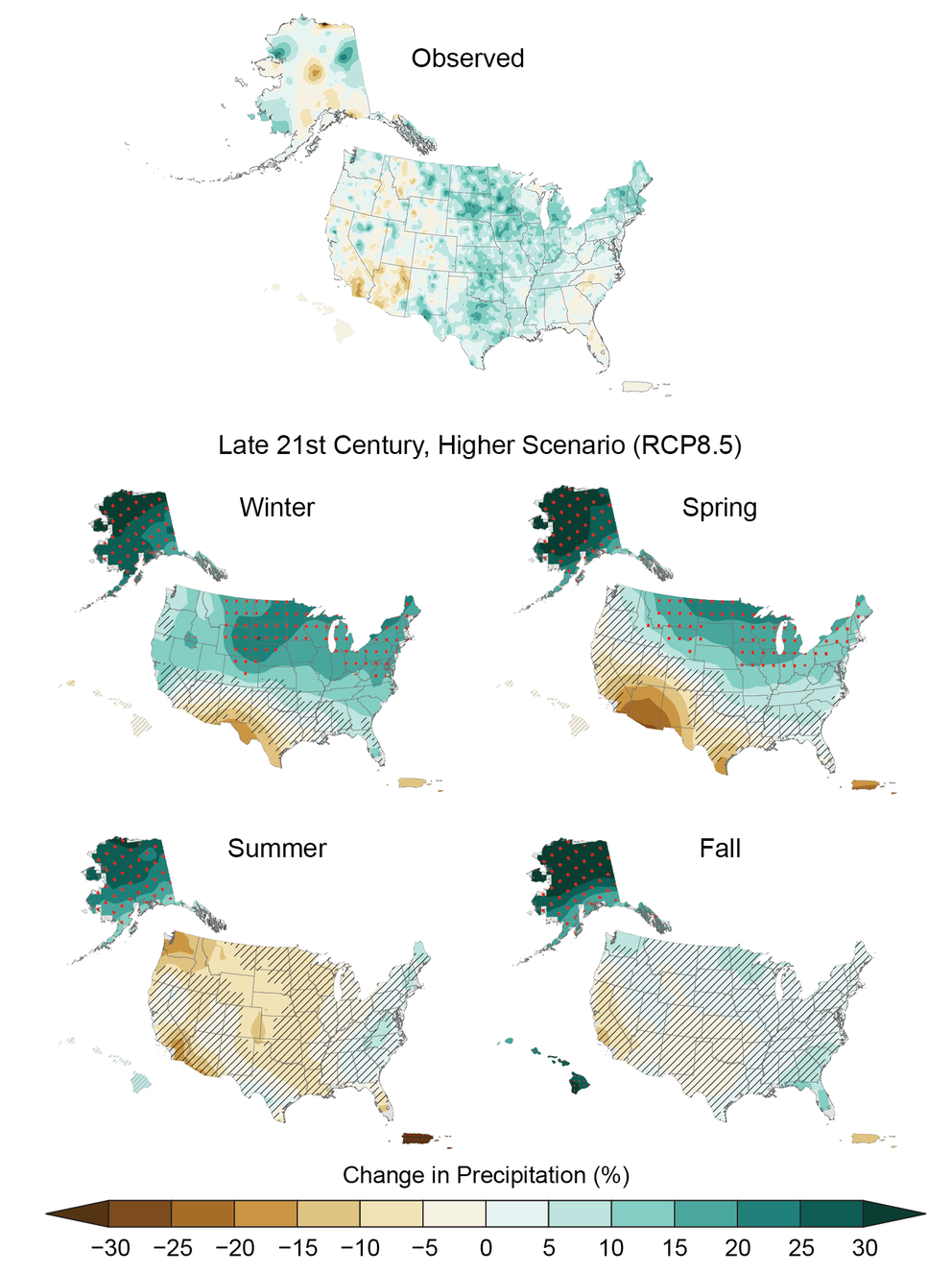
Observed and Projected Change in Seasonal Precipitation
Observed and projected precipitation changes vary by region and season. (top) Historically, the Great Plains and the northeastern United States have experienced increased precipitation while the Southwest has experienced a decrease for the period 1986–2015 (relative to 1901–1960 for the contiguous United States and 1925–1960 for Alaska, Hawai‘i, Puerto Rico, and the U.S. Virgin Islands). (middle and bottom) In the future, under the higher scenario (RCP8.5), the northern United States, including Alaska, is projected to receive more precipitation, especially in the winter and spring by the period 2070–2099 (relative to 1986–2015). Parts of the southwestern United States are projected to receive less precipitation in the winter and spring. Areas with red dots show where projected changes are large compared to natural variations; areas that are hatched show where changes are small and relatively insignificant. Source: adapted from Easterling et al. 2017).{{< tbib '94' 'e8089a19-413e-4bc5-8c4a-7610399e268c' >}}
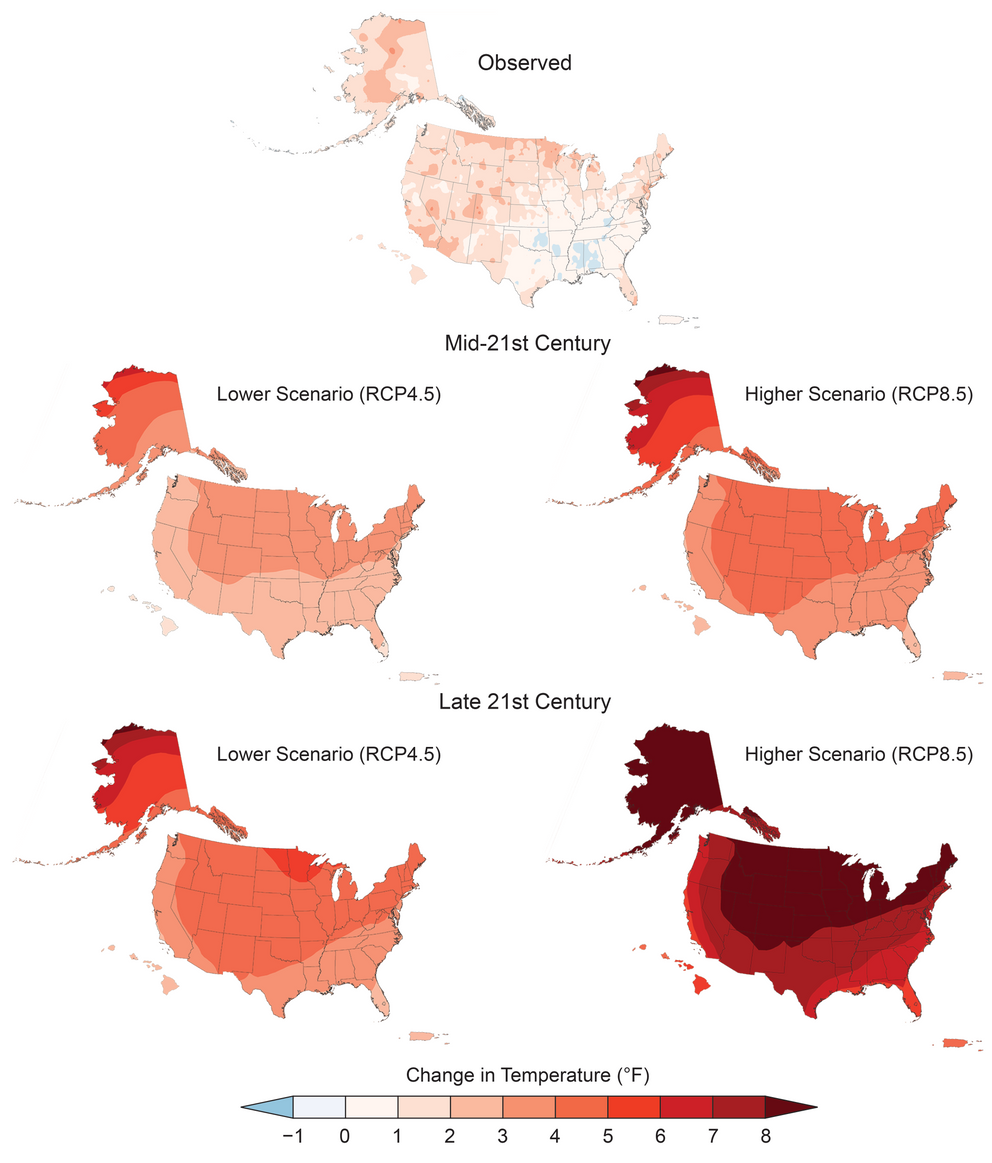
Observed and Projected Changes in Annual Average Temperature
Annual average temperatures across North America are projected to increase, with proportionally greater changes at higher as compared to lower latitudes, and under a higher scenario (RCP8.5, right) as compared to a lower one (RCP4.5, left). This figure compares (top) observed change for 1986–2016 (relative to 1901–1960 for the contiguous United States and 1925–1960 for Alaska, Hawai‘i, Puerto Rico, and the U.S. Virgin Islands) with projected differences in annual average temperature for mid-century (2036–2065, middle) and end-of-century (2070–2099, bottom) relative to the near-present (1986–2015). Source: adapted from Vose et al. 2017.{{< tbib '85' '29960c69-6168-4fb0-9af0-d50bdd91acd3' >}}
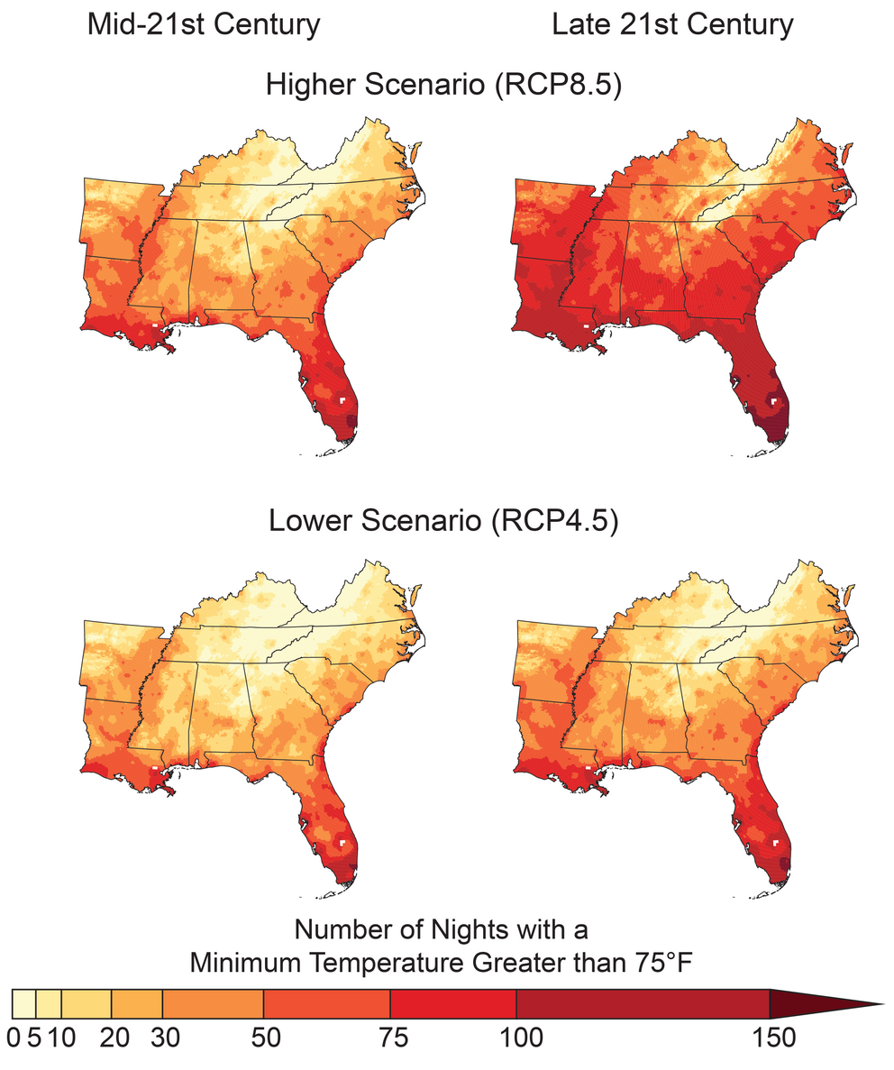
Projected Number of Warm Nights
The maps show the projected number of warm nights (days with minimum temperatures above 75°F) per year in the Southeast for the mid-21st century (left; 2036–2065) and the late 21st century (right; 2070–2099) under a higher scenario (RCP8.5; top row) and a lower scenario (RCP4.5; bottom row). These warm nights currently occur only a few times per year across most of the region (Figure 19.4) but are expected to become common events across much of the Southeast under a higher scenario. Increases in the number of warm nights adversely affect agriculture and reduce the ability of some people to recover from high daytime temperatures. With more heat waves expected, there will likely be a higher risk for more heat-related illness and deaths. Sources: NOAA NCEI and CICS-NC.

Historical Number of Warm Nights
The map shows the historical number of warm nights (days with minimum temperatures above 75°F) per year in the Southeast, based on model simulations averaged over the period 1976–2005. Sources: NOAA NCEI and CICS-NC.
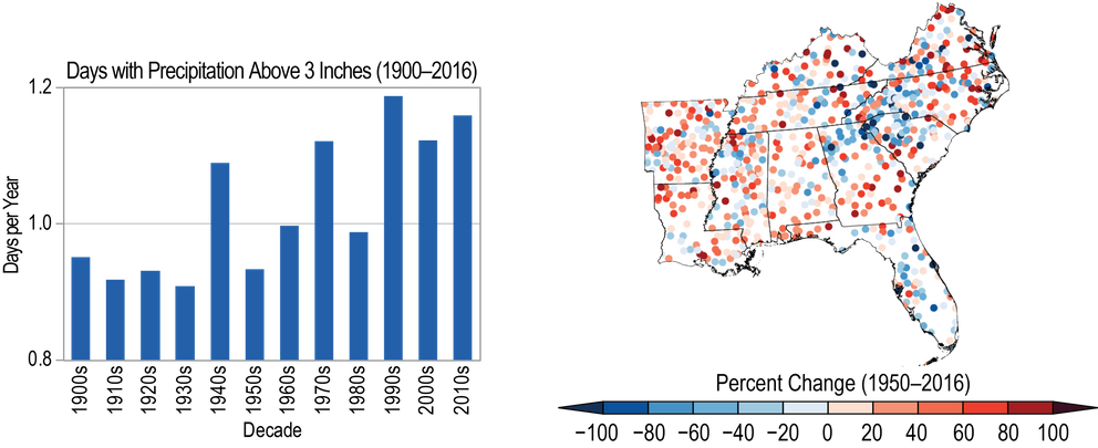
Historical Change in Heavy Precipitation
The figure shows variability and change in (left) the annual number of days with precipitation greater than 3 inches (1900–2016) averaged over the Southeast by decade and (right) individual station trends (1950–2016). The number of days with heavy precipitation has increased at most stations, particularly since the 1980s. Sources: NOAA NCEI and CICS-NC." caption_es: "The figure shows variability and change in (left) the annual number of days with precipitation greater than 3 inches (1900–2016) averaged over the Southeast by decade and (right) individual station trends (1950–2016). The number of days with heavy precipitation has increased at most stations, particularly since the 1980s. From Figure 19.3 (Sources: NOAA NCEI and CICS-NC).

Projected Changes in Cooling Degree Days
The map shows projected changes in cooling degree days by the mid-21st century (2036–2065) under the higher scenario (RCP8.5) based on model simulations. Rural counties experiencing persistent poverty are concentrated in the Southeast, where the need for additional cooling is expected to increase at higher rates than other areas of the country by mid-century. Sources: NOAA NCEI, CICS-NC, and ERT, Inc.
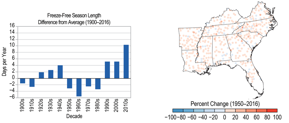
Historical Change in Freeze-Free Season Length
The figure shows the variability and change in the length of the freeze-free season. (left) The bar chart shows differences in the length of the freeze-free season by decade (1900–2016) as compared to the long-term average for the Southeast. (right) The map shows trends over 1950–2016 for individual weather stations. The length of the freeze-free season has increased at most stations, particularly since the 1980s. Sources: NOAA NCEI and CICS-NC.
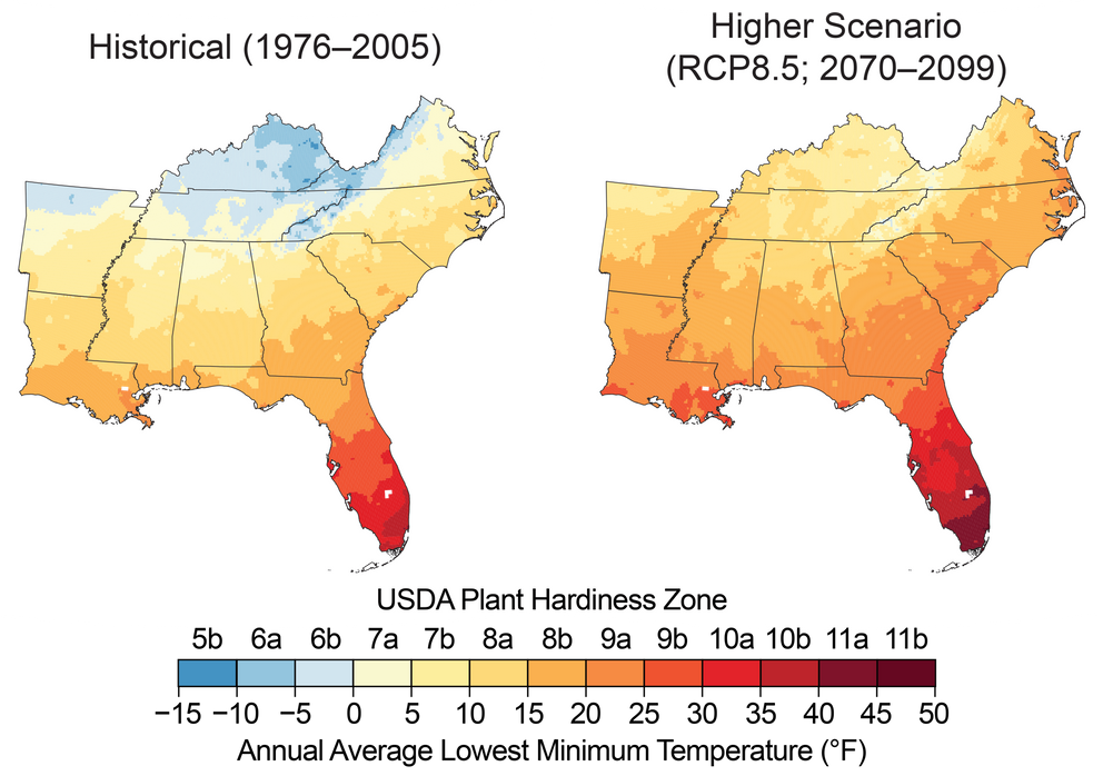
Projected Changes in Plant Hardiness Zones
Increasing winter temperatures are expected to result in a northward shift of the zones conducive to growing various types of plants, known as plant hardiness zones. These maps show the mean projected changes in the plant hardiness zones, as defined by the U.S. Department of Agriculture (USDA), by the late 21st century (2070–2099) under a higher scenario (RCP8.5). The USDA plant hardiness zones are based on the average lowest minimum temperature for the year, divided into increments of 5°F. Based on these projected changes, freeze-sensitive plants, like oranges, papayas, and mangoes, would be able to survive in new areas.{{< tbib '142' '0a8508df-df59-4080-89a2-52bfeaca47e0' >}} Note that large changes are projected across the region, but especially in Kentucky, Tennessee, and northern Arkansas. Sources: NOAA NCEI and CICS-NC.
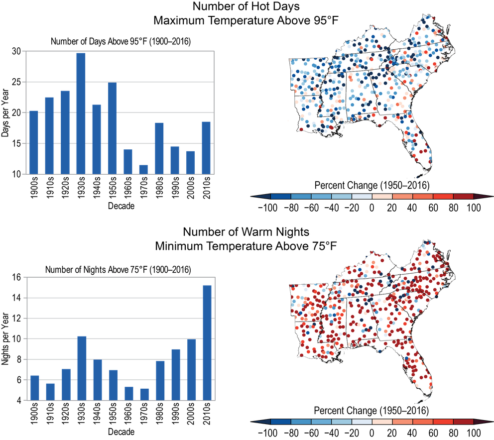
Historical Changes in Hot Days and Warm Nights
Sixty-one percent of major Southeast cities are exhibiting some aspects of worsening heat waves, which is a higher percentage than any other region of the country.{{< tbib '12' '4b55e347-52cb-4301-9eea-ad3858c6fc1d' >}} Hot days and warm nights together impact human comfort and health and result in the need for increased cooling efforts. Agriculture is also impacted by a lack of nighttime cooling. Variability and change in (top) the annual number of hot days and (bottom) warm nights are shown. The bar charts show averages over the region by decade for 1900–2016, while the maps show the trends for 1950–2016 for individual weather stations. Average summer temperatures during the most recent 10 years have been the warmest on record, with very large increases in nighttime temperatures and more modest increases in daytime temperatures, as indicated by contrasting changes in hot days and warm nights. (top left) The annual number of hot days (maximum temperature above 95°F) has been lower since 1960 than the average during the first half of the 20th century; (top right) trends in hot days since 1950 are generally downward except along the south Atlantic coast and in Florida due to high numbers during the 1950s but have been slightly upward since 1960, following a gradual increase in average daytime maximum temperatures during that time. (bottom left) Conversely, the number of warm nights (minimum temperature above 75°F) has doubled on average compared to the first half of the 20th century and (bottom right) locally has increased at most stations. Sources: NOAA NCEI and CICS-NC.
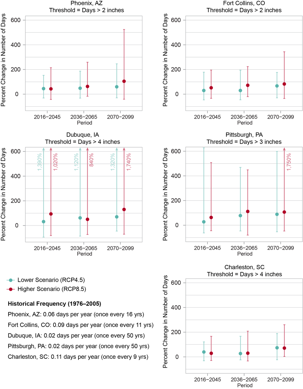
Projected Change in the Number of Days with Heavy Precipitation
Many U.S. cities are projected to see more days with heavy precipitation, increasing the risk of urban flooding, especially in areas with a lot of paved surfaces. Projections of percent changes in the number of days with heavy precipitation (compared to the 1976–2005 average) are shown for each of five U.S. cities under lower (RCP4.5) and higher (RCP8.5) scenarios. Here, days with heavy precipitation are defined as those on which the amount of total precipitation exceeds a threshold value specific to each city. Dots represent the modeled median (50th percentile) values, and the vertical bars show the range of values (5th to 95th percentile) from the models used in the analysis. Modeled historical values are shown for the same thresholds, for the period 1976–2005, in the lower left corner of the figure. Historical values are given in terms of frequency (days per year) and return period (average number of years between events). Sources: NOAA NCEI, CICS-NC, and LMI.

Projected Change in the Number of Very Hot Days
Projected increases in the number of very hot days (compared to the 1976–2005 average) are shown for each of five U.S. cities under lower (RCP4.5) and higher (RCP8.5) scenarios. Here, very hot days are defined as those on which the daily high temperature exceeds a threshold value specific to each of the five U.S. cities shown. Dots represent the modeled median (50th percentile) values, and the vertical bars show the range of values (5th to 95th percentile) from the models used in the analysis. Modeled historical values are shown for the same temperature thresholds, for the period 1976–2005, in the lower left corner of the figure. These and other U.S. cities are projected to see an increase in the number of very hot days over the rest of this century under both scenarios, affecting people, infrastructure, green spaces, and the economy. Increased air conditioning and energy demands raise utility bills and can lead to power outages and blackouts. Hot days can degrade air and water quality, which in turn can harm human health and decrease quality of life. Sources: NOAA NCEI, CICS-NC, and LMI.
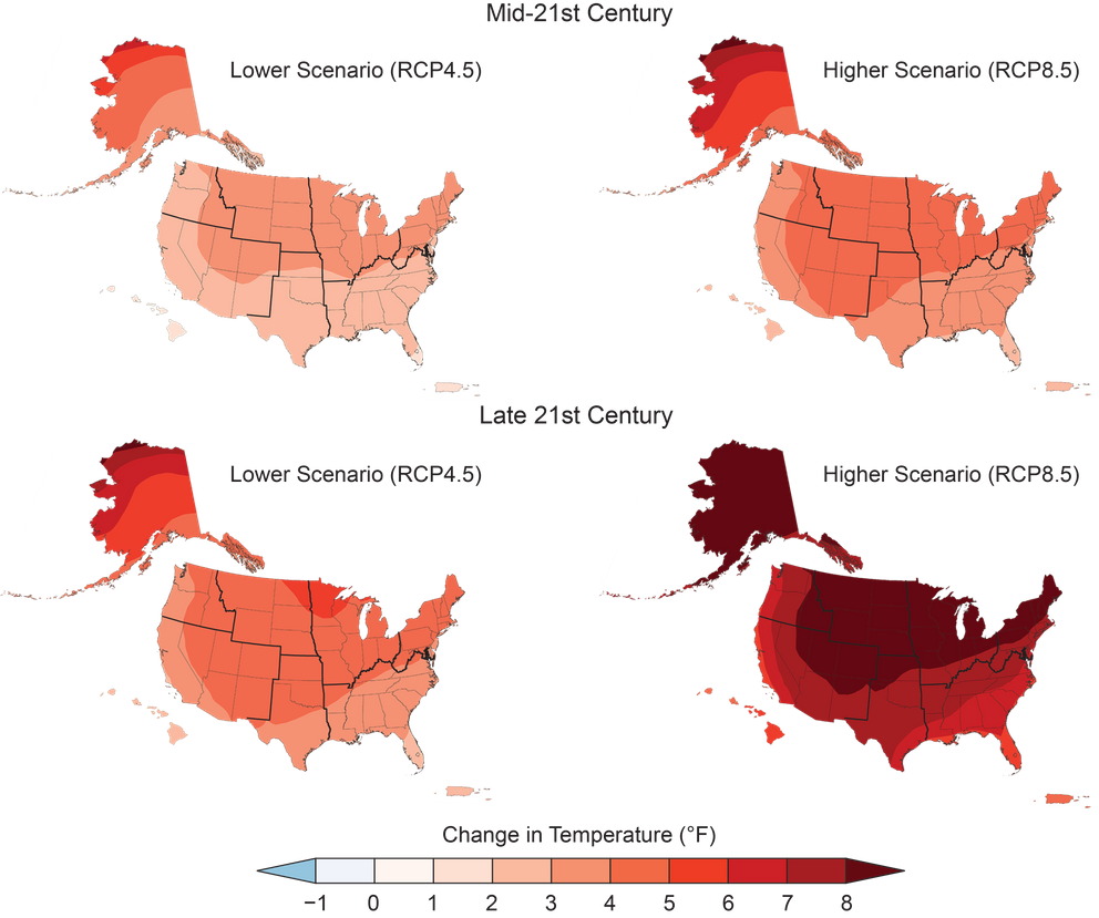
Projected Changes in U.S. Annual Average Temperatures
Annual average temperatures across the United States are projected to increase over this century, with greater changes at higher latitudes as compared to lower latitudes, and under a higher scenario (RCP8.5; right) than under a lower one (RCP4.5; left). This figure shows projected differences in annual average temperatures for mid-century (2036–2065; top) and end of century (2071–2100; bottom) relative to the near present (1986–2015). From Figure 2.4, Ch. 2: Climate (Source: adapted from Vose et al. 2017).
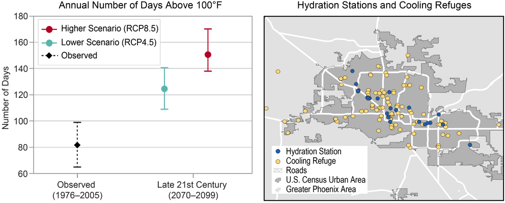
Projected Change in Very Hot Days by 2100 in Phoenix, Arizona
(left) The chart shows the average annual number of days above 100°F in Phoenix, Arizona, for 1976–2005, and projections of the average number of days per year above 100°F through the end of the 21st century (2070–2099) under the lower (RCP4.5) and higher (RCP8.5) scenarios. Dashed lines represent the 5th–95th percentile range of annual observed values. Solid lines represent the 5th–95th percentile range of projected model values. (right) The map shows hydration stations and cooling refuges (cooled indoor locations that provide water and refuge from the heat during the day) in Phoenix in August 2017. Such response measures for high heat events are expected to be needed at greater scales in the coming years if the adverse health effects of more frequent and severe heat waves are to be minimized. Sources: (left) NOAA NCEI, CICS-NC, and LMI; (right) adapted from Southwest Cities Heat Refuges (a project by Arizona State University’s Resilient Infrastructure Lab), available here. Data provided by Andrew Fraser and Mikhail Chester, Arizona State University.