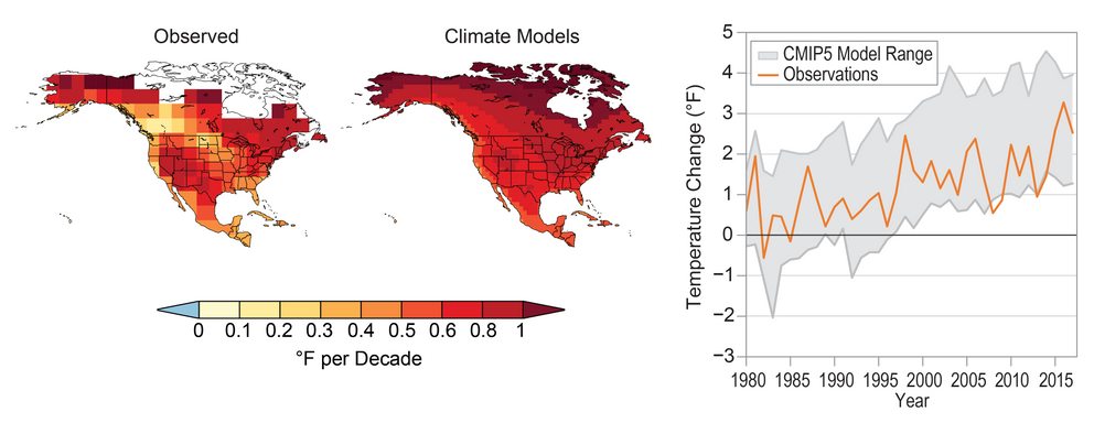
Comparison of Climate Models and Observed Temperature Change
Climate simulations (right map) can capture the approximate geographical patterns and magnitude of the surface air temperature trend seen in observational data for the period 1980–2017 (left map). The warming pattern seen in the right map is an average based on 43 different global climate models from the Coupled Model Intercomparison Project Phase 5 (CMIP5). The graphical representation shows the range of temperature changes simulated by the models for North America (relative to 1901–1960; gray shading, 5th to 95th percentile range) overlaid by the observed annual average temperatures over North America (orange line). The observed temperature changes are a result of both human contributions to recent warming and natural temperature variations. Averaging the simulations from multiple models suppresses the natural variations and thus shows mainly the human contribution, which is part of the reason small-scale details are different between the two maps. Sources: (maps) adapted from Walsh et al. 2014{{< tbib '6' 'ee2ad491-9e02-4f29-859a-07970e4d1de1' >}} and (graph) NOAA NCEI and CICS-NC.

