NCICS’s Jared Rennie is exploring what NOAA NCEI’s new U.S. Climate Normals reveal about how our climate is changing across the United States.
On May 4, 2021, NOAA’s National Centers for Environmental Information (NCEI) released an update to its 30-year U.S. Climate Normals. These climate normals provide daily, seasonal, and annual averages for maximum, minimum, and average temperatures; growing-season length; total precipitation; snow depth; and more. These are the values that TV meteorologists rely on to tell you whether today was warmer or colder than normal or whether your area experienced more or less rainfall than average in a given month. They also provide critical information that farmers, water managers, and many other stakeholders use for planning and decision-making.
The previous climate normals were calculated based on conditions for the 1981–2010 period, while the new climate normals move everything forward by 10 years to provide averages for 1991–2020. These climate normals are not really intended as a tool for monitoring or understanding climate change. However, an obvious question in a warming climate is how the 1991–2020 normals compare with the 1981–2010 normals.
To help answer that question, NCICS’s Jared Rennie has been working with the climate normals team at NCEI to develop data analyses and mapping tools. Some of those maps were featured in NCEI’s web story on the normals update. And if you were reading or watching the news or following climate and weather topics on social media on May 4th, there’s a good chance you saw some of Jared’s work used to illustrate the changes reflected in the updated normals (see below for some highlights of that coverage).
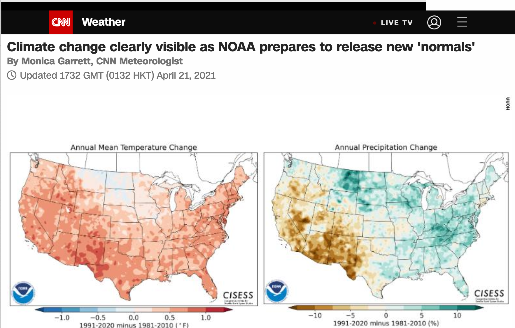
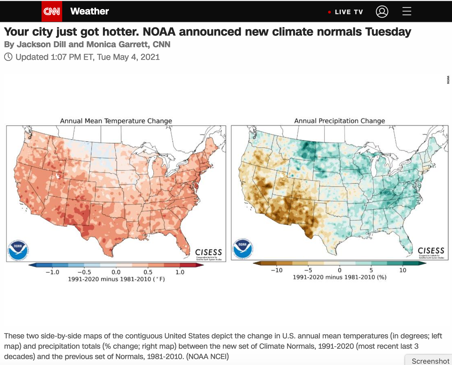
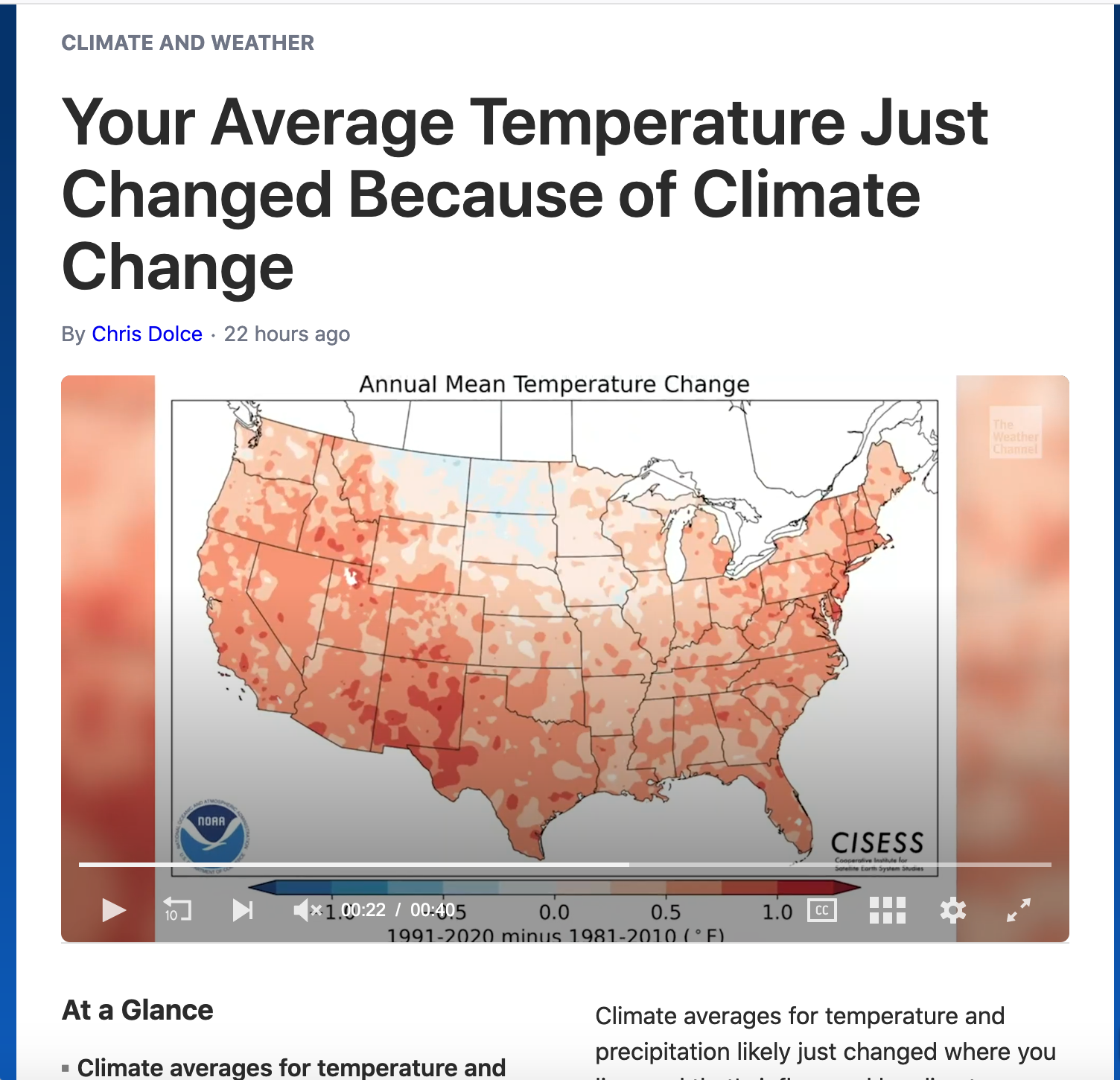
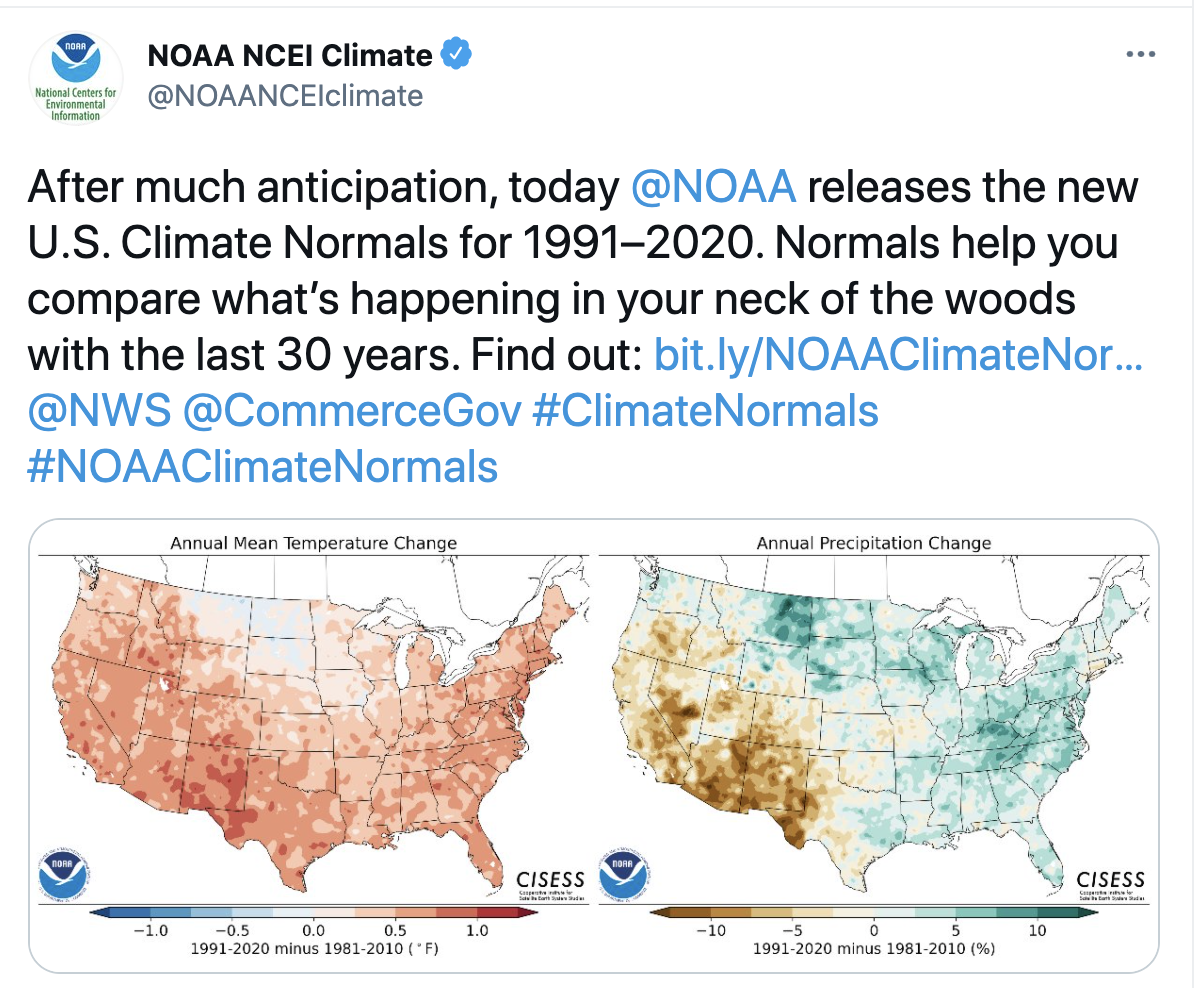
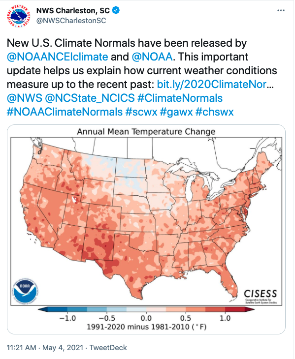
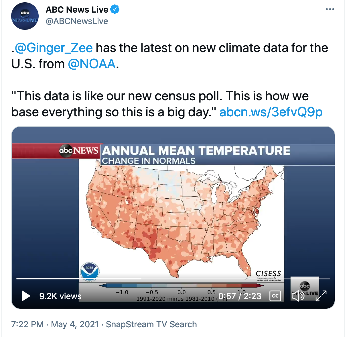
For example, the figure below compares how annual average temperatures changed in the 1991–2020 normals relative to the 1981–2010 normals. Replacing data from the 1980s with data from the 2010s results in temperature increases of nearly 1°F in annual average temperatures across most of the country, with the exception of portions of the upper Midwest and Great Plains, which saw little change or even cooling in some areas.

Differences in annual average temperatures for the contiguous United States in the 1991–2020 U.S. Climate Normals compared to the 1981–2010 Normals.
On the global scale, the climate is warming rapidly due to greenhouse gas emissions and other human influences. But trends at regional and local scales are influenced by a variety of other factors, resulting in a lot of variability in how climate change plays out across different locations, seasons, and weather variables. In the coming months, Jared and his NCEI colleagues will be using these climate normals comparisons to help understand how weather patterns and other local factors influence changes.
Meanwhile, if you would like to see how average daily temperatures and precipitation totals changed in the new normals in your area, check out this ArcGIS online map Jared developed: https://www.arcgis.com/home/webmap/viewer.html?webmap=2f745679483f4d6ebca9c6d5bdd39fca. You can zoom in and then click on an individual station dot to see a chart showing how the new normals compare to the old normals for every day of the year at that station.
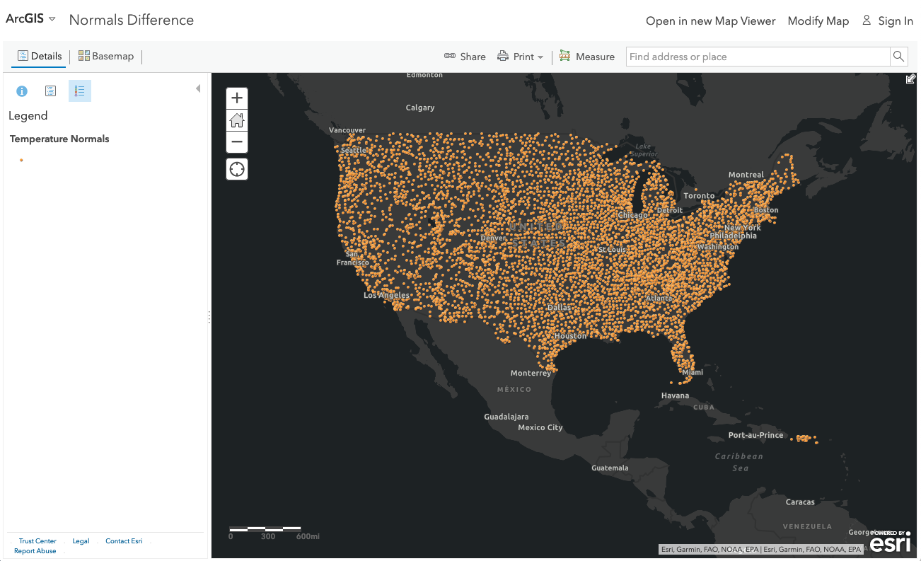
You can use this ArcGIS online map to see how daily temperature and precipitation averages changed in the new normals for thousands of weather observing stations around the country.
Media Coverage Highlights
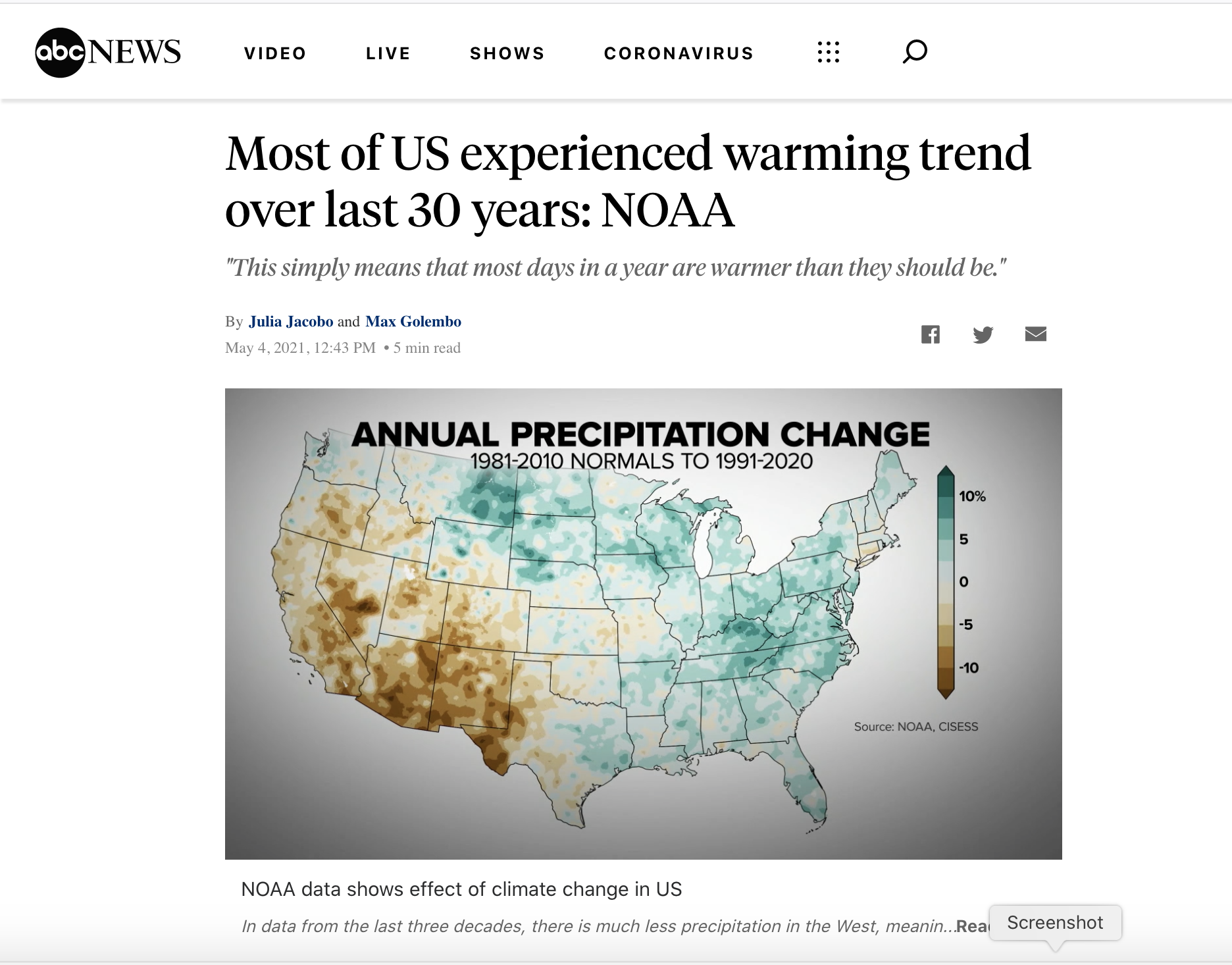
ABC News: Most of US experienced warming trend over last 30 years: NOAA
Julia Jacobo and Max Golembo. May 4, 2021
https://abcnews.go.com/US/us-experienced-warming-trend-30-years-noaa/story?id=77485202
CNN: Climate change clearly visible as NOAA prepares to release new ‘normals’
Monica Garret. April 21, 2021.
https://edition.cnn.com/2021/04/21/weather/climate-change-new-us-normals-noaa/index.html
CNN: Your city just got hotter. NOAA announced new climate normals Tuesday
Jackson Dill and Monica Garret. May 4, 2021
https://www.cnn.com/2021/05/04/weather/climate-change-noaa-normals/index.html
Weather Channel: Your Average Temperature Just Changed Because of Climate Change
Chris Dolce, May 4, 2021
https://weather.com/news/climate/news/2021-05-04-new-noaa-normals-released-1991-2020
Social Media Highlights
NOAA NCEI Twitter:
https://twitter.com/NOAANCEIclimate/status/1389602750439243778
NOAA’s National Weather Service Charleston office was just one of many NWS offices posting about the new U.S. Climate Normals:
https://twitter.com/NWSCharlestonSC/status/1389601052408745988
ABC News Tweet
https://twitter.com/ABCNewsLive/status/1389722049392881665
Resources
NOAA NCEI Web Story: https://www.ncei.noaa.gov/news/noaa-delivers-new-us-climate-normals
National Weather Service Page: https://www.weather.gov/ict/newclimatenormals