Homogenized Temperature Data at Submonthly Frequencies
Researchers interested in how heat waves and cold waves are changing over time, or in how particular heat or cold events compare to the historical record, face a data challenge: most daily or weekly temperature datasets have not been corrected to account for artificial shifts that arise from changes in station location, instrumentation type, and the time of day at which observations are taken. These non-climatic shifts, or breaks, in the data make it impossible to reliably evaluate trends or compare events from different time periods.
In a new paper in the Journal of Applied Meteorology and Climatology, NCICS researchers Jared Rennie and Kenneth Kunkel and their coauthors report on a new submonthly temperature dataset designed to fill that important gap.
Organizations such as NOAA provide monthly datasets that do include careful corrections for these artificial shifts. This correction, or homogenization process, makes these datasets suitable for analyzing changes over time. But heat waves and cold waves rarely last as long as a month, nor do they conform to the arbitrary months of the Julian calendar.
To deal with that challenge, the authors set out to develop a new homogenized dataset with observations at submonthly frequencies. (Why submonthly rather than daily? More on that in a moment.) The dataset is built on observations from more than 7,000 weather stations in NOAA’s Global Historical Climatology Network-Daily (GHCN-D) database. Only those GHCN-D stations that meet several criteria are included. For example, each station has to have valid observations for at least 300 days per year for at least 10 consecutive years.
To correct for non-climatic shifts, the team applied the same monthly homogenization adjustment factors used in NOAA’s monthly GHCN product. That is, each daily observation in a given calendar month was adjusted by a common factor computed for that month. These adjustment factors were based on both information about known station moves and other changes as well as a sophisticated, automatic detection-and-correction algorithm. The validity of this approach was confirmed by computing monthly averages and comparing the results to NOAA’s operational nClimDiv product. The adjusted daily observations were then converted to departures from normal by subtracting NOAA’s 30-year (1981–2010) climate normals (average values) from the daily observation values. Providing the data as differences from normal conditions rather than as absolute temperatures is important for comparing conditions between different areas or seasons, where average temperatures can vary widely.
Finally, to minimize the effects of day-to-day variability and uncertainties related to applying monthly homogenization factors to daily data, the daily observations were averaged up to various time periods, starting at a minimum of three days (hence the “submonthly” description, since the data were available only at periods of three days or more). Similarly, the data were aggregated at various geographic scales, starting at NCEI climate divisions and working up to states, the regions defined by the National Climate Assessment, and the contiguous United States. The goal here was to smooth out small-scale variability and uncertainty while still providing data at a sufficiently high frequency and fine enough spatial resolution to allow for useful analysis of small-scale extremes and trends.
Analyzing Temperatures and Extreme Heat Events
The dataset facilitates analyzing temperatures at various scales and over a range of time periods. For example, Figure 1 shows how the average temperature over the three days ending on May 27, 2018, compared to averages over the same three dates in the historical record (1901–2018). Rankings are shown for each state (except Hawai‘i, which is currently not included in the dataset). Most of the country was well above average, and many states in the north-central part of the country experienced the warmest average on record for that three-day period. California and Alaska were exceptions, with unusually cold temperatures.
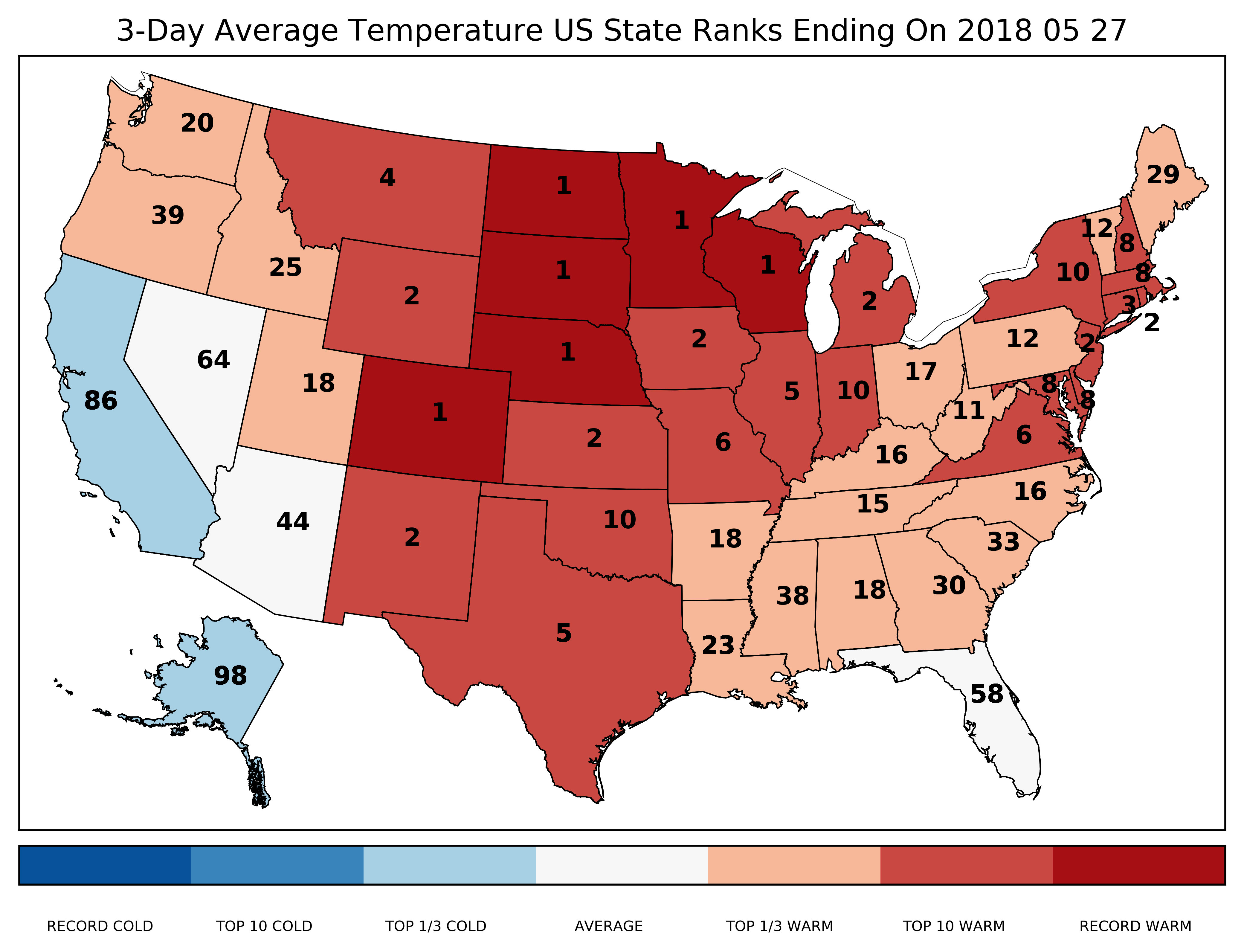
Figure 1: State-by-state rankings (with 1 being the warmest on record) for daily average temperatures for the three-day period ending on May 27, 2018. Source: Rennie et al. 2019.
The team also developed a climatology of extreme heat events and studied how these heat events are changing over time. They focused on events with temperatures that were considerably warmer than normal—at or above the 98th percentile—at a given location for at least three days in a row.
Calculations were done separately for daily maximum and daily minimum temperatures, and these respective “hot days” and “warm nights” events were analyzed by frequency, length, and severity, including how much warmer than normal those 98th-percentile events were and how individual events ranked against the other events in the historical record. These results were computed for seasons and the various geographic areas, and trends were analyzed for the full record (1901–2018) and a more recent period (1951–2018).
The climatology revealed diversity in these 98th-percentile events by region, season, and metric. For example, the Southwest experienced the largest number of maximum-temperature events, while the Southeast experienced the most minimum-temperature events. For maximum-temperature events, the average departure from normal varied between 4.1°C and 6.5°C (7.4°F and 11.7°F). For minimum-temperature events, the range was 2.7°C to 5.3°C (4.9°F and 9.5°F).
Looking at changes over time for the contiguous United States (CONUS), as shown in Figure 2, the team found little to no trend in the number of events with very high daily maximum temperatures, but they identified strong trends in the number of events with very high minimum temperatures, particularly over the 1951–2018 period, during which events increased by 5.58 per decade. Similarly, there is little to no trend in the length of events based on daily maximums, but there is a clear trend in the length of minimum-temperature events (an increase of 0.11 days per decade since 1951).
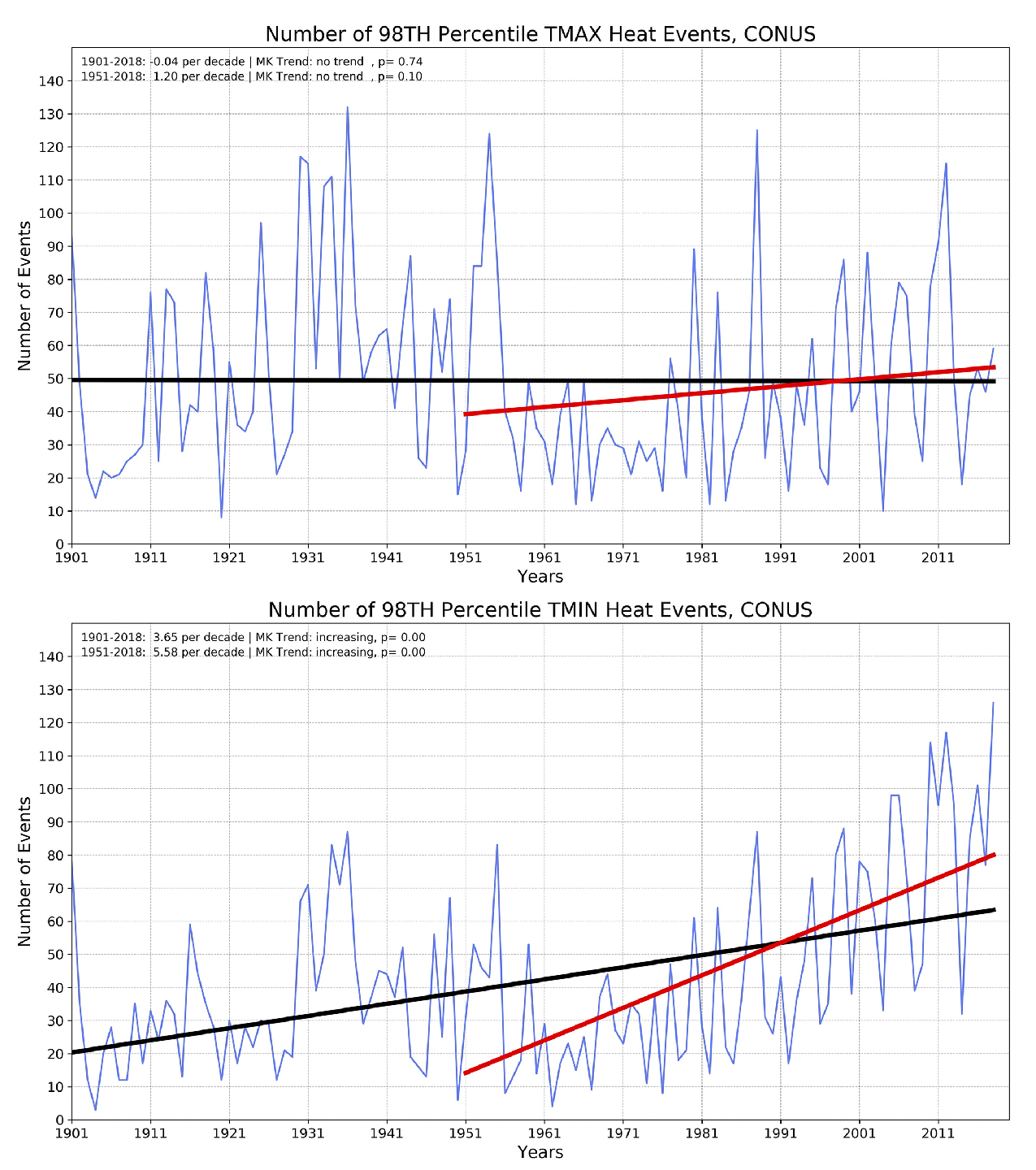
Figure 2: (top) There is a little to no trend in the number of events per year for which daily maximum temperatures are at or above the 98th percentile for three days or more, but (bottom) there are clear trends in the number of such events for daily minimum temperatures. Source: Rennie et al. 2019.
Be sure to check out Jared Rennie’s Twitter thread describing the paper and the new dataset.
The research was also recently highlighted by NOAA’s Climate Program Office.
You can experiment with recent, near-real-time submonthly observations yourself via a monitoring tool hosted on the NCICS website: https://ncics.org/portfolio/monitor/sub-monthly-temperatures/
Rennie, J., J. E. Bell, K. E. Kunkel, S. Herring, H. Cullen, and A. M. Abadi, 2019: Development of a submonthly temperature product to monitor near-real-time climate conditions and assess long-term heat events in the United States. Journal of Applied Meteorology and Climatology, 58, 2653–2674. http://dx.doi.org/10.1175/JAMC-D-19-0076.1